But how did Pantone become the authority of color, and how can they choose a color to define a year? The concept originated at the Pantone Color Institute in 1999 as part of their education program. The company wanted to show that color and culture were intertwined and that what is happening in the world can be reflected and expressed through the language of color. Since 2000, the Color of the Year has become an increasingly popular tradition, not just in the design and art world, but has worked to shape trends in design, marketing, consumer products, and more, sparking conversations about the intersection of color and culture.
“Since we introduced Pantone 15-4020 Cerulean Blue as the first Pantone Color of the Year in 1999, we have seen this program influence product development and purchasing decisions in nearly every industry and country around the world," said Laurie Pressman, Vice President of the Pantone Color Institute, about COTY's growing popularity and its societal influence. "Growing in popularity each year, its impact is felt across fashion, color cosmetics, home furnishings, automotive and industrial design, as well as product, packaging, multimedia design, and commercial interiors.”
Each year, a team of color experts at Pantone analyzes global trends in various fields, including fashion, art, technology, and even socio-economic factors, to identify a color that reflects the current cultural climate. The chosen color serves as a symbolic representation of the collective mood and serves as a source of inspiration for designers, creatives, and businesses worldwide.
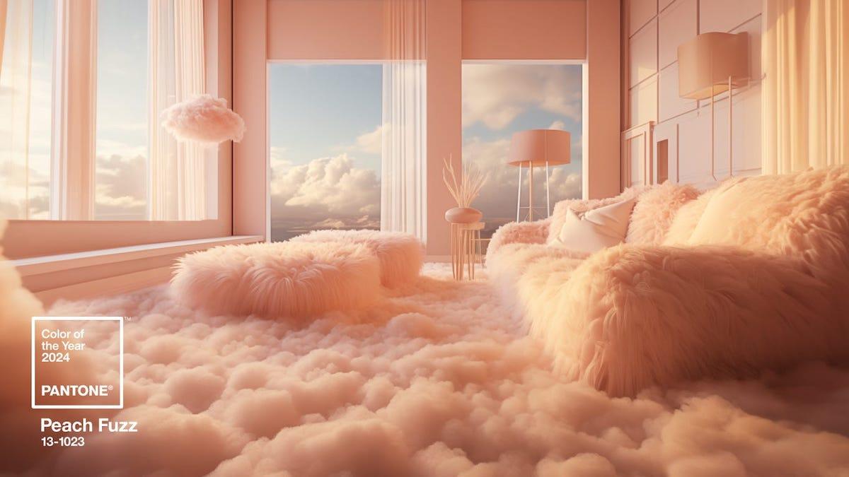
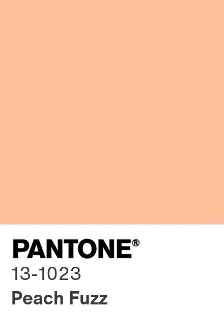
This year’s hue is much more gentle and subdued than the vibrant magentas, violets, and bright yellows of the past few years, which contrasts with the current cultural climate. Amid a powerful and divisive war and an important election in the not-too-distant future, this peachy tone reminds us to take a breath and stay centered.


