Museum  August 16, 2022  Kathleen Cullen

Drawing Center's “The Clamor of Ornament” Uncovers our Shared Humanity

The Metropolitan Museum of Art, Library Purchase (161.1 C44 Q). © The Metropolitan Museum of Art. Image source: Art Resource, NY.

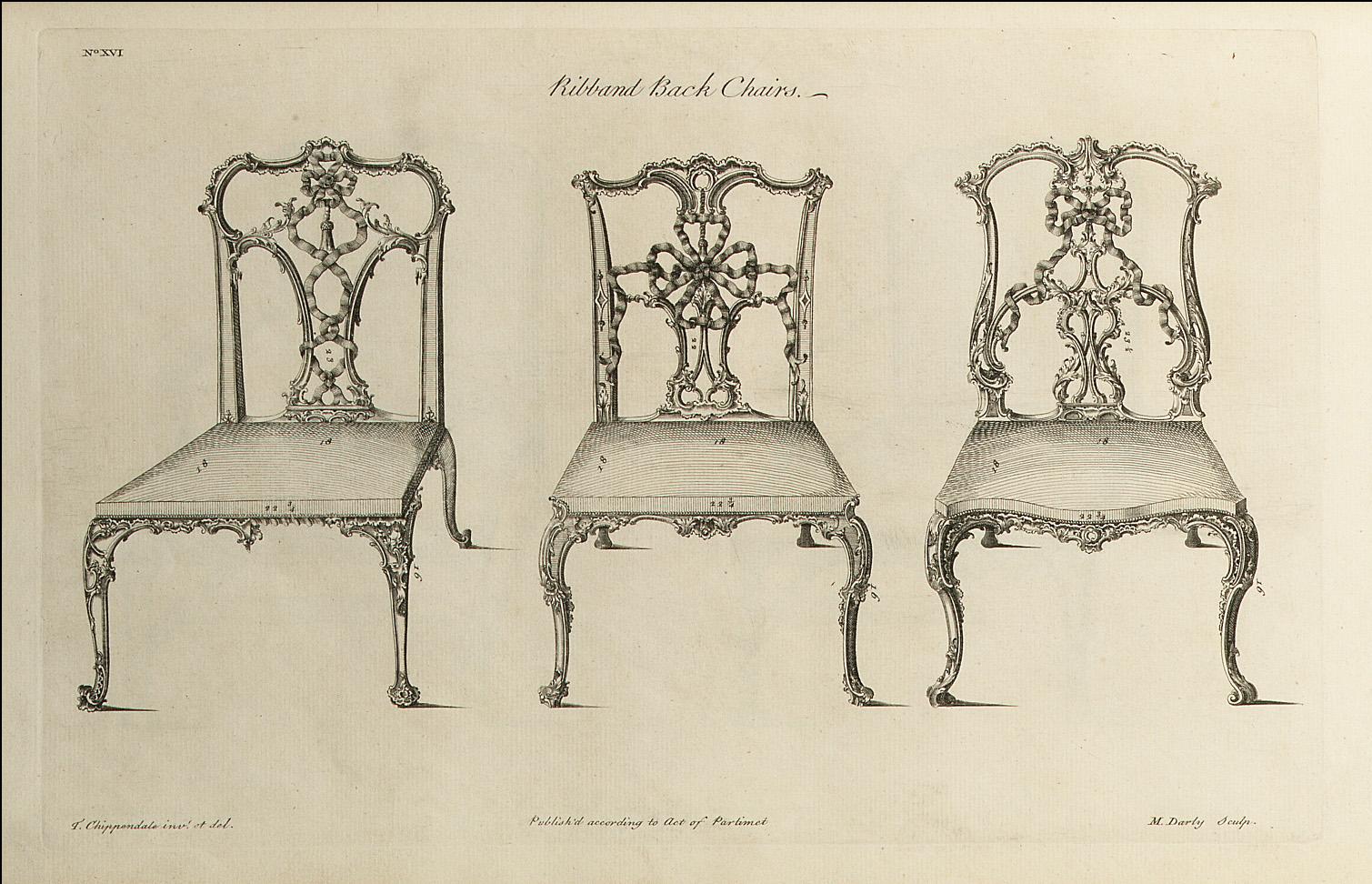
Thomas Chippendale, The Gentleman and Cabinet-maker's Director: Being a Large Collection of . . . Designs of Household Furniture in the Gothic, Chinese and Modern Taste . . ., 1754. Printed book, engraved plates. 17 3/4 x 12 1/4 x 2 inches (45 x 31 x 5 cm).

A profound visual message fills the Drawing Center’s latest exhibition, The Clamor of Ornament: Exchange, Power, and Joy from the Fifteenth Century to the Present.

The Clamor of Ornament brings together Asian motifs in English design—fifteenth century wood blocks, fragments of Japanese textiles, Duro Olowu clothing design, Tiffany drawings, and graffiti in a riotous cacophony of pattern each act as ciphers used to convey specific meanings about culture. Nothing included here is insignificant.

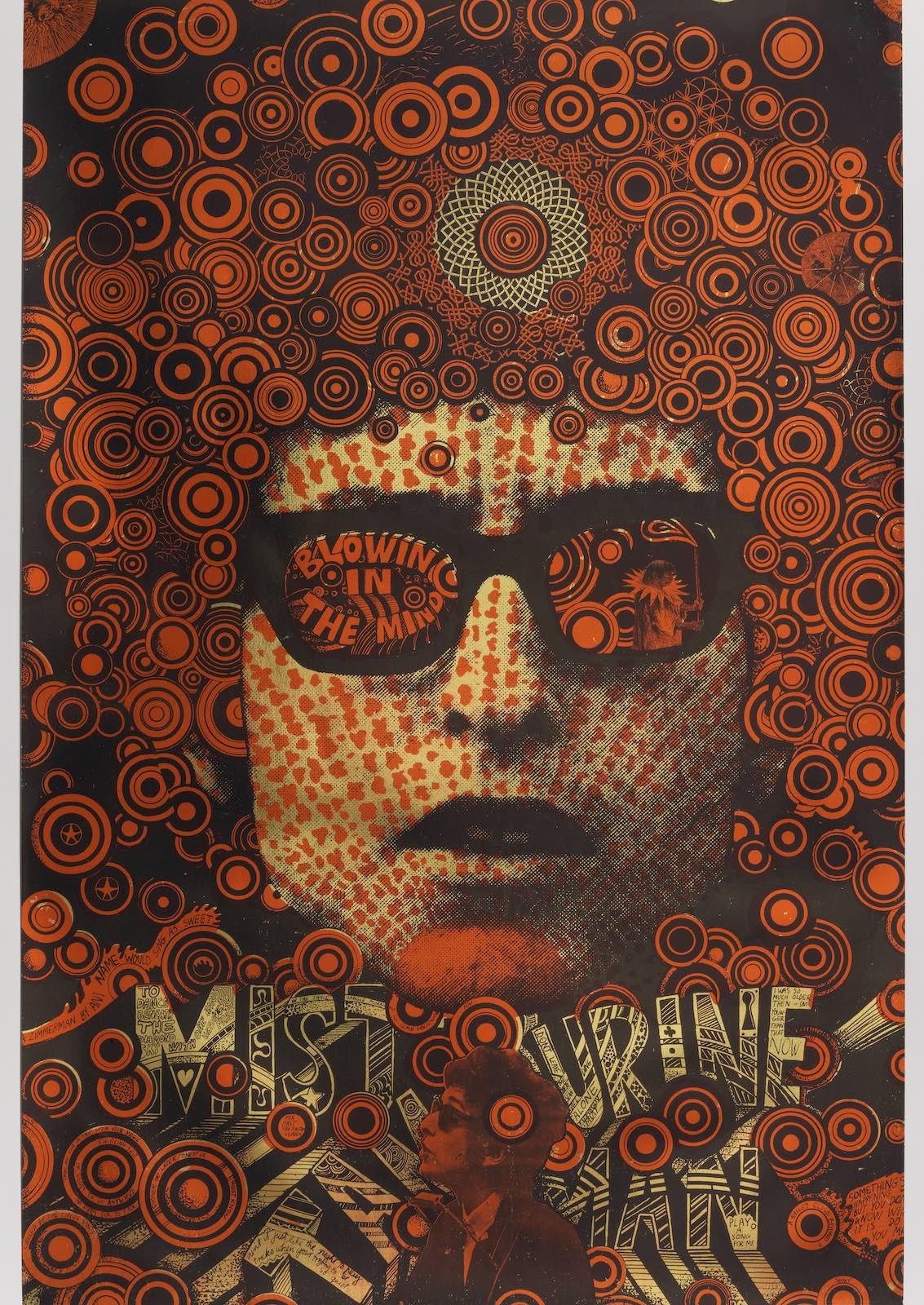
The curators set a welcome stage for the visitor to the Center. Greeting them at the entrance is Martin Sharp’s Blowing in the Mind/Mister Tambourine Man (1968). Sharp is known as the mastermind behind posters and album covers for some of the biggest names in ’60s rock and roll history. Think Donovan, Eric Clapton, and Cream. His shapes and colors possess the same kind of intensity as the music of the period— a ‘Summer of Love’ intensity that carried through every aspect of the culture. By 1970, this poster had sold over 100,000 copies, a true success of its time.

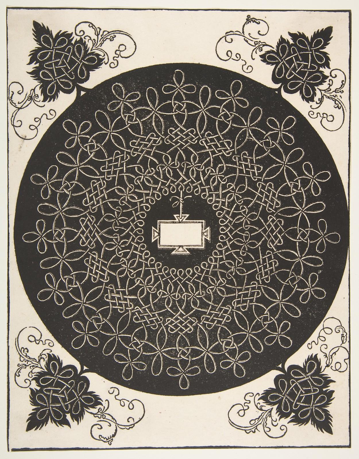
Placed adjacent to Sharp’s poster, there’s Albrecht Dürer’s 1521 print of an interlaced roundel with a shield in its center. Formal similarities between the Sharp and Dürer overwhelm, as the Dürer Knot motif is displayed dead center and the reverberating circle patterns of Dylan’s head of hair give us two very similar representations of mystical spiral affirmations, disseminated in the popular mediums of posters and prints over 500 years apart.

Martin Sharp, Blowing in the Mind/Mister Tambourine Man, 1968.
Gift of Sara and Marc Benda. Cooper Hewitt, Smithsonian Design Museum, Smithsonian Institution. © Copyright Agency. Licensed by Artists Rights Society (ARS), New York, 2021.

Martin Sharp, Blowing in the Mind/Mister Tambourine Man, 1968. Lithograph on wove paper. 29 7/16 x 19 7/8 inches (74.8 x 50.5 cm).

Albrecht Dürer after Leonardo da Vinci “The Second Knot,” Interlaced Roundel with an Amazon Shield in its Center,
The Metropolitan Museum of Art, George Khuner Collection, Bequest of Marianne Khuner, 1984 (1984.1201.30).

Albrecht Dürer after Leonardo da Vinci “The Second Knot,” Interlaced Roundel with an Amazon Shield in its Center, before 1521. Woodblock print. 10 3/4 x 8 3/8 inches (27.3 x 21.3 cm).

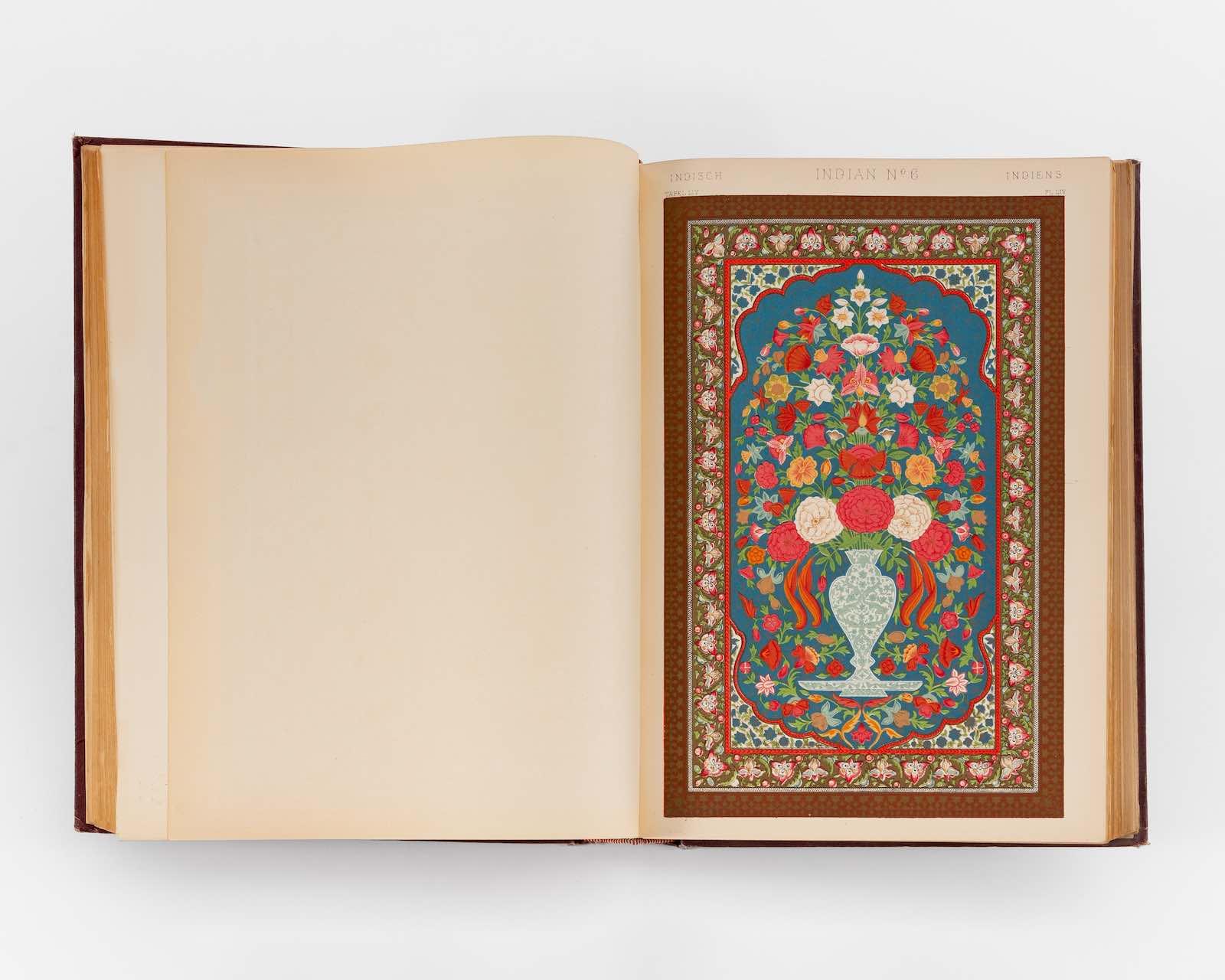
The show's title is adapted from the architect Owen Jones’ 1856 publication The Grammar of Ornament. The book preserved an approach to ornamentation that was used by European architects in the second half of the nineteenth century.

Here we have Jones’ beautiful watercolors on loan from the Victoria and Albert Museum representing examples of ornamentation from ancient times through the nineteenth century in spectacular color plates. Jones’ renderings illustrated the intoxicating beauty of ornament.

Initially, Jones considered some cultures more aesthetically accomplished than others. He ranked Islamic design at the apex, disparaging those from China in favor of the elaborate geometry found in examples from nature. Ultimately, Jones withdrew this argument about the inferiority of Chinese design. In 1867, he devoted an appendix volume to Chinese ornament. The drawings shown here were copied from artifacts in South Kensington Museum’s collection, and Jones’ joy in Chinese detail and embellishment is evident.

Courtesy of Michele Oka Doner. Photograph by Daniel Terna @jpegs_ and_tiffs.

Owen Jones, The Grammar of Ornament, 1865. Book with 100 chromolithograph plates. 13 1/2 x 10 x 2 3/4 inches (34.3 x 25.4 x 7 cm).

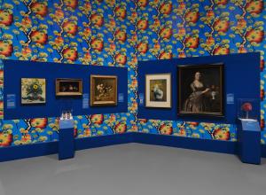
The exhibit, designed by Studio Frith, attempts to do away with the white cube presumptions about ownership and taste by employing numerous design strategies such as saturated color walls and elegant cursive wall labels based upon the Chippendale motif. This very same motif is repeated on one of the exhibition’s catalogue covers (there are three alternate versions).

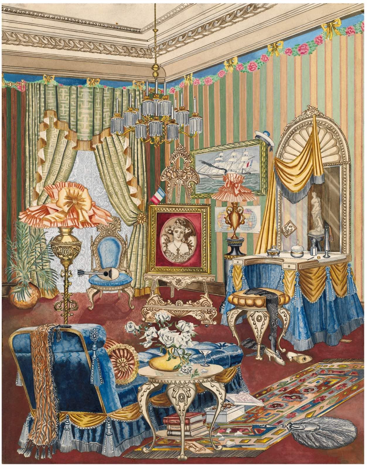
The Federal Art Project Work Release program sent 400 illustrators across the United States to document the nation’s decorative arts heritage. All the documentation was rendered in watercolor and they were to depict an object that was distinctively American in design and ornamentation. Of the 18,257 illustrations in the Index of American Design that portray objects, lifestyles, and influences, none is campier than that of Perkins Harnly’s Boudoir from 1931.

Inspired by matinee idol Lillian Russell, Boudoir depicts a haphazard bedroom decked out with travel mementos, lush carpets, knick-knacks, a Sarah Bernhardt portrait, and feathers—all in an attempt at self-actualization on the part of the artist. Harnly was said to have won numerous drag competitions in his alter ego, based on a characterization of Bernhardt. The featured theatrical Victorian aesthetics and bedroom designs never existed in Russell‘s world.

National Gallery of Art, Washington. Index of American Design, 1943.

Perkins Harnly, Boudoir, c. 1931. Watercolor, gouache, and graphite on paper. 22 5/8 x 17 13/16 inches (57.5 x 45.3 cm).

As a young boy, Harnly grew up on a farm and this Boudoir drawing represents his drag persona yearnings emerging from the WPA and the Great Depression. Working within a grandiose framework, Harnly’s narratives aspire to another lifestyle. With irony and satire, the artist captured the décor of an era. Within his idiosyncratic, high/low domestic interiors—fringe drapes, fading flowers on a table, champagne, bonbons, and naughty books—the room is fitted-out as though it too is in drag.

No slouch in the gallery world, Harnly had his first exhibition at Julien Levy Gallery in 1938 with known artists such as Joseph Cornell and Toulouse-Lautrec. After the show, he began working with the Index of American Design and Federal Art Project, who mounted an exhibition at the Metropolitan Museum in 1942 titled, I Remember That.

Film producer Albert Lewin invited Harnly to Hollywood after seeing this exhibition, giving him numerous assignments that included the set designs for the film The Picture of Dorian Gray. Additionally, Harnly’s work was the subject of a solo exhibition at the National Museum of American Art (now the Smithsonian American Art Museum) in 1981. The career of Perkins Harnly has been the starting point for discussions about the cultural connection of homosexuality, queer connection, and the Victorian style.

This author urges readers to visit the exhibition or order the catalogue. For those able to visit, notice how the various artworks appear and reappear, emphasizing the historical continuum of the narrative of ornamentation. The groupings redefine movements, influences, and patterns while subtly questioning the chain of power.

The exhibition was organized by guest curator Dr. Emily King with Duncan Tomlin and Margaret-Anne Logan. The catalogue features contributions from architect Farshid Moussay and writer Shola von Reinhold. It also features an interview with designer Duro Olowu and The Drawing Center’s Executive Director Laura Hoptman.

About the Author

Kathleen Cullen

Kathleen Cullen is a former gallerist, independent curator, and writer for CultureCatch.com. She was also the former head of sales for Art & Object. Cullen’s role as a director-curator permits her to maintain an independent spirit, presenting new artists “on the edge” by feeling the “pulse” of the emerging art market. It is this inalienable eye that posits her as a harbinger of new artistic expression.

Subscribe to our free e-letter!

Webform
Art and Object Marketplace - A Curated Art Marketplace